POSTER ANALYSIS
Like Magazine covers, Poster's for films are fantastic ways of both advertising your product & telling audiences what your film is about, hopefully enticing people to watch the film upon seeing an effective poster. Poster's can use imagery, text & themes to appeal to many particular audiences, whether they be niche or mass-market audiences.
Below are four effective posters for different kinds of films that each in their own way are very effective in attracting the attention of those who are interested,
Below are four effective posters for different kinds of films that each in their own way are very effective in attracting the attention of those who are interested,
SAW
|
The SAW movie poster is very effective. There is not a lot included in the poster but it is clear what the poster is trying to portray, the poster is mainly white, allowing the red blood to stand out for the audience, giving it a more eerie feel to it. At the top of the poster a saw is shown, this is referring to the actual title of the film, Saw. The main focus point of the poster is the chopped off hand in the middle of the poster, this catches the audiences eye and gives them a feel of what the film is going to be like, it makes the audience feel unsettled as what is shown is quite disturbing to some people.
A slogan is included in the poster just below the title of the film, this slogan gives the audience a little clue about what happens in the film and also unsettles the reader as the slogan is creepy. The title of the film is placed in the center, making it stand out to the audience to ensure they do not miss it, it is also in a dark colored font to make it stand off of the background. The use of the grubby, dirty hand and the dirty saw at the top of the poster, stands out the audience and gives the impression to the audience that this is not a nice film in terms of blood and gore etc. |

|
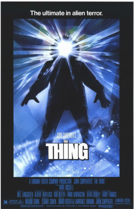
THE THING
|
The poster for 'The Thing' uses many things to make itself stand out as a horror film. The colours used are a very important part of this poster the black border makes what is in the middle of the poster stand out even more really drawing the audience to the man in the snow jacket he is blacked out however his face is letting out a blinding white light this adds a sense of mystery making the whoever is looking at it think who or what is it.
The shades of blue and white with the icy glass effect make it clear that the movie takes place in a cold environment. The posters slogan is 'the ultimate in alien terror' some people will read this and will want to know if its as scary as the poster sugests making them watch it |
|
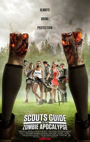
SCOUTS GUIDE TO THE ZOMBIE APOCALYPSE
|
The poster for "Scouts Guide To The Zombie Apocalypse" immediately makes it apparent that the film is likely a comedy horror, similiar to that of Zombieland, with the five characters shown all looking as if they are dressed in a comic-relief fashion.
The zombie legs in the posters foreground suggest she has been decapitated or brutally disembodied, which is usually unseen in most 'serious' zombie films & TV series' such as "Dawn of the Dead" or "The Walking Dead". The poster features bright colours in the background, and vibrant & dark colours in the foreground, emphasising the contrast between the comedy & horror aspects of the film. The film's Title Font is also blatantly contrasting the film's theme, as most other horror & zombie themed films feature titles that are very much more gory or unsettling & red. The title here is a combination of blocky white font used to emphasise innocence, and the effect fo the title bursting outwards from the center, creating that animated feel to the film upon first glance of the poster. |
|
SMILEY
The poster for the film 'Smiley' is very effective, the main characters or the protagonists are below the killer smiley, suggesting that they are his prey, they are the victims. The killer 'Smiley' has been centered as the main feature of the poster showing the audience what the victims are coming up against.
|

|
OUR POSTER