QUESTION 1 - IN WHAT WAY DOES YOUR MEDIA PRODUCT USE, DEVELOP OR CHALLENGE FORM AND CONVENTIONS OF REAL MEDIA?
Our media trailer develops, challenges and follows typical media conventions in many ways throughout the trailer. In some ways we wanted to challenge the usual cliche's used in horror movies, this is because we wanted our trailer to stand out from the others and be like no other to make it more enjoyable and different for the audience. However we still wanted to follow some conventions typically used in successful horror films as we still want ours to be successful, some conventions almost have to be used to make it successful.
Using Typical Conventions
In some cases throughout the making of our trailer we decided to follow some popular conventions usually used in horror films.
Having a male killer is seen as a typical convention of horror films, it is rare to see a female killer as they are usually the victim, but it is not unknown for the killer to be female. We decided to follow this convention as we thought a male killer is stereotypically thought as more threatening and overpowering compared to a female, so a male would be best for our trailer.
|
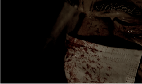
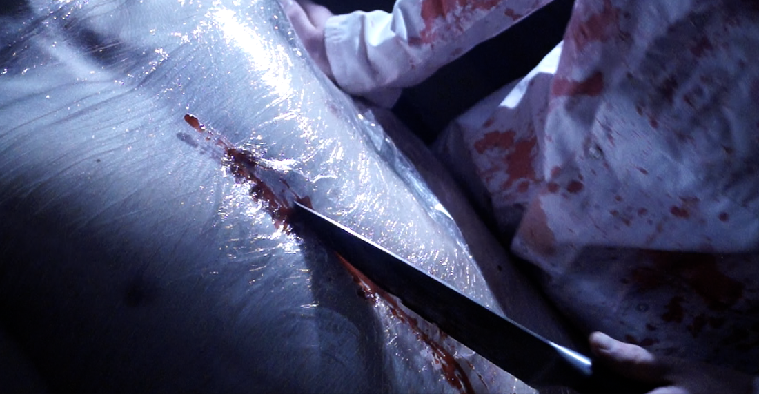
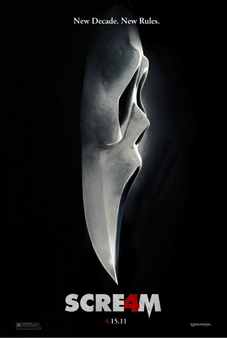
In our trailer we followed the typical convention of having the male killer use a standard kitchen knife as one of his weapons. In many iconic horror films such as Scream, Halloween and Psycho, a similar knife is used as it is perfect to create a bloody scene and gives a chance for the killer to get up close and personal with the victim. We thought it was a weapon we couldn't leave out of our trailer as it is such an iconic weapon of choice. |
|
|
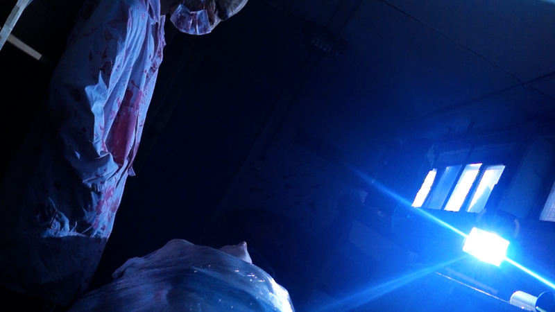
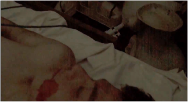
We filmed in many dark areas in our trailer, this is a typical horror convention as near enough all horror films take place in dark places. This convention almost has to be used in all horror films as the dark lighting and gloomy atmosphere helps the audience recognise the killer is close or about to "strike". It creates an eerie feeling for the people watching the film and puts them on edge. |
|
The sounds we used within our trailer followed conventions of popular horror films, we used creepy ambience background sound in order to create a scary atmosphere for the audience. Many popular horror films use this in their trailers as it is very effective to help make the audience feel uneasy. So leaving out background sound in our trailer would not be a smart move as it would completely change the trailer and the atmosphere it gives. |
|
Challenging Conventions
|
In our horror trailer we challenged a few typical horror conventions in order to try and make our film different from the usual. One way we challenged conventions was by casting a male victim instead of a female victim. So often in horror films the victim is a pretty blonde girl who gets killed off, however we thought that was overused in horror films so decided to cast two males to try and escape this nightmare. |
|
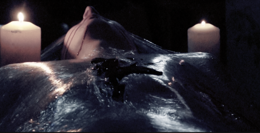
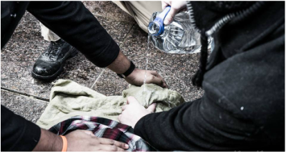
Another way we tried to challenge conventions was by adding in some torture scenes that were not just all about blood and gore. So many horror films such as SAW rely on bloody scenes to make the audience cringe, we decided to take a different approach in one of our scenes by waterboarding him. An old torture technique which involves pouring water over the victims face whilst he has a towel over him, making it nearly impossible to breathe. |
|
|
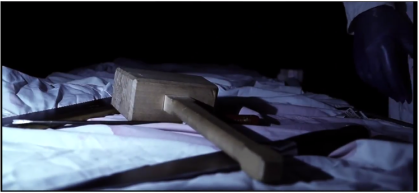
In many slasher films that aim to include as much blood and gore as possible, the weapons used will most likely be tools such as, knives, chainsaws, machete's etc. We decided to try and use a weapon that isn't often used a lot in horror films, a mallet, this challenge conventions as we discussed as a group what weapons are not commonly used in horror films and none of us could remember a horror that uses a mallet.
|
Poster
|
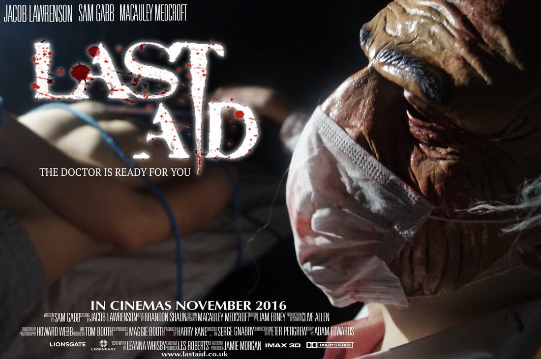
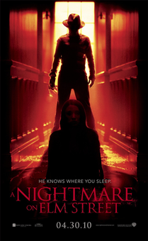
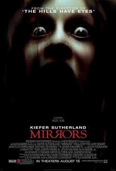
When creating our poster we wanted to make the background dark and eerie, this is because we wanted the audience to instantly know from the colours that it is a horror related poster. Many horror posters use these dark colours for their posters, such a "A Nightmare On Elm Street" and "Mirrors". We also didn't show much of the victim and what he looks like to not give too much information away and the killer has been made the centre of attention of the poster by putting him in full focus.
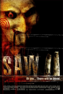
For our poster we wanted to incorporate our killer into it, in order to make it more scary for the audience and so that they realise that it is a horror. We took inspiration from other horror posters we looked at such as SAW and SCREAM, they both clearly show what the killer in the film looks like, so we took this idea an put it into our poster. The font we used in our poster is a simple font style however we have decided to put a twist on it by trying to make the "T" look like a knife, which is one of the weapons used in the film and it is also an iconic use of weapon. The way we tried to make the "T" look like a knife was inspired from SAW II, they have used two fingers to symbolise the number 2. The old dirty fingers used in the poster is taken from the actual film, so it gives an idea to the audience of what the film is like, we have tried to do the same. We also used a blood splatter on our title to help give the impression of blood and gore, people will instantly realise it is a horror film when they see this. |
|
|
