QUESTION 2 - HOW EFFECTIVE IS THE COMBINATION OF YOUR MAIN PRODUCT AND ANCILLARY TEXTS?
When branding our product we had to make sure that the images we use are easily recognised by our target audience and are associated with our final product. We want people to look at our work and instantly know what it is. This is why it is so important to build our brand identity. There are a number of ways for us to identify our trailer, we focus on the persona of the character being a deranged old man which is a very typical trope in horror. We also need to know how to stand out from our competitors and this is another reason why branding is so important. The two best ways for us to establish our brand identity is to have an iconic image people will remember. The second way is to create an iconic and memorable title text.
|
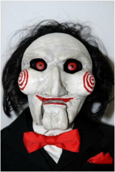
Saw was released in 2004 and is now one of the most iconic torture porn franchises in horror today with 6 movies to its name. Due to its overwhelming popularity almost anyone can recognise the film from the puppet used in the film. In the movie it is used as a way for the killer to communicate with the victim it is only on screen for 40 seconds to a minute at a time it also adds a level of mystery to the killer but due to how iconic the design is people always recognise it. This is why they use it as the poster boy when advertising. This is very useful when establishing your brand. even though the puppet is controlled by the killer is is like its own character with its own personality. Another thing that makes it memorable is how it plays off peoples fear of puppets.
|
|
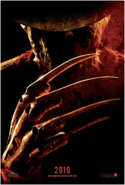
Freddy is the poster boy for the horror movie franchise a nightmare on elm street. Made in 1985 this movie was made famous by the killer and his iconic weapon the claw glove and his unique way of killing his victims. This weapon is a strong part of the franchises branding and because of this it is used in almost all of the movies promotional material. The character Freddy wears a lot of red as well as always being surrounded by a kind of red tone. Because all of the colours associated with Freddy audiences will think of the nightmare on elm street whenever they see red. as Freddy was burnt to death and he is very disfigured however he is still human and this makes the audience afraid because they will think anyone could be Freddy making them fear the loss of their own humanity.
|
A movies title text is also a very good way of creating a brand identity by making your title iconic and unique it will stand out among the other films and the audience will be more likely to remember it which is the main goal when marketing your movie. bellow are some examples of iconic movie titles.
|
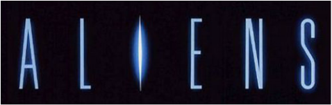
As far as SIFI horror goes Aliens is possibly the most iconic and famous film of all time this was one of the most unique concepts in the industry. The title and text for this movie is very different compared most films. all of the letters are spaced very far apart and the the pale blue colours used fit perfectly with the SIFI theme. The light blue glow of the letters works well with the pitch black background as it shows a sort of hopelessness.
|
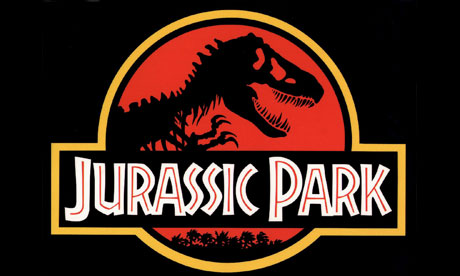
Jurassic park is the 1993 blockbuster sifi directed by Steven Spielberg with on of the most iconic soundtracks and possibly the best CGI of its time but the focus here is the title. the stand out text used is bold white writing with red lines through each letter this kind of thing isn't often seen in movie titles so this really ads to the brands identity and will defiantly make viewers remember it. Another stand out part of this title is the skeletal dinosaur silhouette on the red background is supposed to show the danger of people in an enclosed environment with a horde of man eating dinosaurs. The yellow outline is used draw attention to the image in the centre.
Here is our poster and magazine cover we have taken ideas from other movie posters and other well known magazines to help us create the most eye catching and appealing product posible.
|
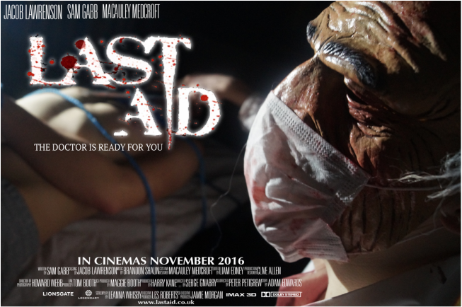
This is our poster for our movie trailer Last Aid we have made the title for our poster bold writing to stand out and we have added a blood splatter over the text, we did this because it is relevant to our chosen genre of a slasher with a lot of gore we have called the movie last aid as an opposite to first aid as that is ment to heal and help you and our made up concept of last aid is ment to injure harm and maybe even kill you. the main focus of our poster is the killer/doctor as he is the main point of fear. the victim is blurred out in the background behind as he is unimportant as he is simply one of the many victims of the killer. The phrase 'the doctor is ready for you' is used to give the audience so kind of back story.
|
|
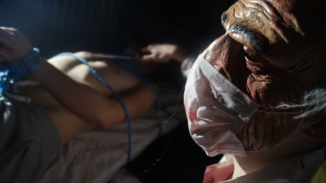
This is the unedited image we used for our poster we felt it was important to to have the killer at the front as the main subject like with the rest of the promotional materials. We have the killers victim in the background out of focus as he is unimportant and we don't want him to get too much of the attention we made sure to keep then surroundings as dark as possible to keep the feeling of mystery.
|
|
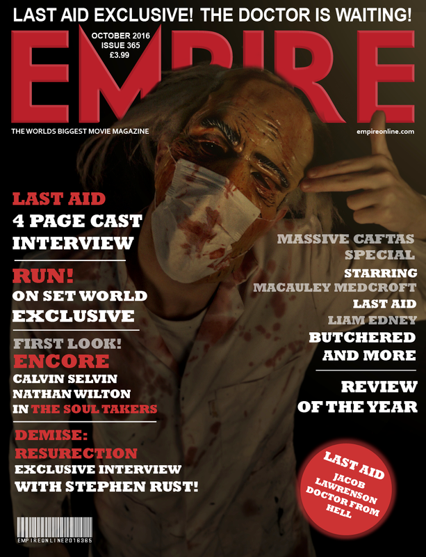
For our magazine cover we used the specific set up and layout of of the of the popular magazine series Empire. we decided to to use the Empire because it is a very well known and is very eye catching due to the big bold writing it also gives us a lot of ways to set up the page. Because our horror is a slasher we decided to keep a colour theme of red for the main title and the sub titles because it fits with the blood stains on character on the cover we believe that it is very important to keep a level of consistency when establishing our brand identity. Like other empire magazines we have promoted our movie along with other horror products we did this because we want our target audience to think about horror so our movie sticks in their mind. in order to make it look like a convincing magazine cover we had to pay attention to the small but important details that real magazines have, for example we did research into the average price of an empire magazine we settled for £3.99 we also included a bar code. another detail we added was the release date of the magazine we October 2016 we chose this date because the movie is being released in November of the same year as a lot of the time these magazines are released before the film with behind the scenes and exclusive interviews with the actors giving the audience a sneak peak at our product. one detail we used is the way the empire logo is in the background and is over lapped by by the images on the cover this is something that is very specific to empire so we thought it would be very important to use it.
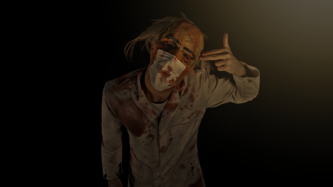
This is the original image for our magazine cover after a many photo shoots we decided to use this image for our magazine as we think it best captures the killers psychopathic nature. it also sticks out looking directly at the audience and with noting in the background the audience will remain focused on the killer.
|
